Evernote kan zoveel beter zijn met een visuele presentatielaag.
voor jullie gelezen bij Chuck Frey – Hij gebruikt Webjets.io als voorbeeld, maar het kan ook met vrijwel elke MindMap software
Evernote’s missing piece: A visual layer
Recent reports state that Evernote, once a darling of Silicon Valley, is now in a “death spiral” after the departure of four C-level executives, slowing sales of its paid individual subscriber product and lackluster adoption of the enterprise version of Evernote.
One reason for these problems is that Evernote is a relatively mature product that, in some ways, hasn’t kept pace with the needs of its business users.
One fundamental problem I see has to do with the types of thinking tasks knowledge workers must perform today. In today’s business environment, many of the easy problems have been solved, thanks to kaizen, lean, agile and other improvement initiatives. What remains are more complex, systemic challenges that require higher-level thinking skills to solve.
Simply put, Evernote Business doesn’t add enough value to teams. It enables sharing of notes and notebooks, and integrates communication and collaboration tools like Slack, but don’t support higher-level thinking activities like brainstorming, sense-making and consensus building.
The solution: Add a “visual layer” to Evernote
What’s the solution to this problem? Imagine adding a visual layer to Evernote, integrating a tool like Webjets.io (click here for my interview with the founders of this web app earlier this year).
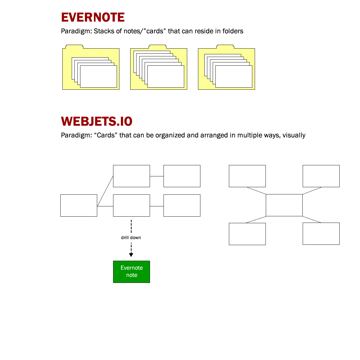
Imagine Evernote as a stack of index cards. Its folders are the equivalent of different “piles” that I can use do do rudimentary organization of my notes. But that model doesn’t give me the ability to easily set up visual workflows or to see connections between disparate notes. It’s not easy to see what’s missing, or where there’s duplication of content. And it doesn’t support arranging notes into sophisticated visual models to support strategic tasks like defining business processes, doing 4-quadrant analyses, team-based brainstorming or consensus building.
Like Evernote, Webjets.io is based on a card interface, but give its users much greater flexibility, arranging them in ways that make sense — in linear rows and columns, as process flows, as mind maps or other complex visual structures.
I can easily envision a scenario where Webjets.io could enable individuals or teams to brainstorm, plan and define relationships between pieces of information, yet still be able to “drill down” into individual notes within Evernote. Something like this:

In a sense, adding a visual layer to Evernote could enable users to get much more value out of their notes then ever before. After all, notes are not islands unto themselves. Rather, they are connected with each other in different ways.
Users need the ability to express those relationships — visually — and to use them to find connected ideas. The ability to provide an expanded view of information and knowledge is the key to Evernote’s future.